

BrainStation Video Classroom
An on-campus experience, online.
What is the Video Classroom?
The Video Classroom is the custom-built video conferencing software that BrainStation uses to run the online instances of their courses and bootcamps.
In the wake of the Covid pandemic, BrainStation needed to look at their online experience. Before, they used Zoom and Meet which were perfectly serviceable, but they wanted to elevate their online experience to the same level as their on-campus classes. It was decided that we, the BrainStation digital team, would create our own video conferencing program. It was built on top of Amazon Chime, but otherwise everything was bespoke.
The Team

1 × Product Lead

1 × Technical Lead and
3 × Developers

1 × QA

1 × UX / UI Designer (Me)
The Goals

Create a polished and professional UI

Keep the interface intuitive and familiar to users (Jakob’s Law)

Give online students an experience on par with those on campus

Provide instructors all the tools they need to deliver a class to the BrainStation standard
Why build your own video conferencing platform?

Tailor the experience with all the functionality you need (and none of the ones you don’t)

Integrate with the rest of the BrainStation ecosystem (accounts, permissions, attendance etc.)

Stand out above the rest: a BrainStation branded experience feels that much more professional and special than an off-the-shelf solution
Wireframes
At the time I began wireframing, the full scope of the tool wasn’t laid out. We pretty much just knew we wanted to make a video conferencing tool. I felt a good baseline to start with was getting feature parity with other similar software. The main focus in the beginning was nailing the video tile layouts.
Getting the obvious ideas out of the way. A simple grid of faces, arranged like a classroom.
A more conventional video conferencing layout with a primary speaker.
A split view that tries to maximize the space not occupied by the class (this grid view was a requirement at this point). Inspiration from gaming tournaments on Twitch. Clipping corners out of presentations was a no-go.
Another streamer inspired layout, that places the presenter in the corner of their presentation. Once again, hiding presentation content was a non-starter.
Along the lines of the final product. The lion’s share of screen real estate is for any presentations going on, the largest camera feed will belong to the presenter, and random students will be placed underneath.
Onboarding and Pre-Class Experience
The introductory onboarding page for the online classroom. This walks students through setting up all of their audio and video for an optimal classroom experience. Onboarding only needs to be done once.
Just like with Google Meet, we want to give users the opportunity to check their audio and make sure their camera isn’t picking up something private before entering the class.
If the student is very early to class, they will be left in this state until closer to start time where they will be let in.
Before class actually begins and the virtual space is enterable, there is a waiting room. This simulates the on-campus experience of arriving early and hanging out with classmates.
The Main Classroom Experience
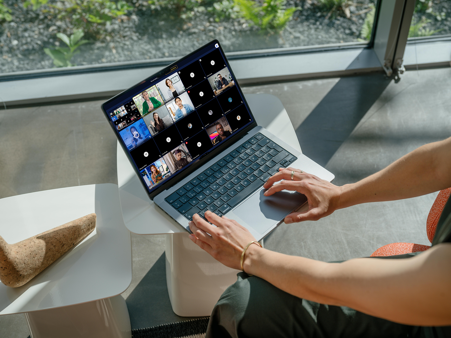
A standard view when the instructor is not presenting. There are a couple of states that are demonstrated here as well (raised hand, hardware/networking issue, and disconnected)
When the instructor presents, their video feed is shifted over to the right grid, making room for the screenshare.
The chat feature slides over the class list.
The additional actions menu expanded.
The small arrow can be clicked to quickly swap audio and video hardware, as well as access settings.
Emoji reactions. Instead of the confetti style that Google Meet uses, the actual count of reactions is shown in the bottom left corner. It pulls double duty: a silent way to express yourself to the class and for instructors to informally tally votes (e.g. does everyone get this concept before we move on? Vote thumbs up or down).
Speakers will have their words automatically transcribed into text to help more visually-oriented users following lessons/conversations. There is also a “history” of all the generated captions so that students can go back to read anything logged later on.
Collapsed sidebar state. The little tab in the top right can be clicked to reveal it again.
Hovering over any video tile reveals buttons which allows users to select a grid layout. An expanded view where a single tile takes up the entire space, a grid of 5x5 tiles, and a hybrid between the two.
Fullscreen mode hides the bottom bar and makes its’ background transparent. It can be revealed by moving the cursor.
Grid view. Through much testing, we found that 25 tiles (5x5) was the best we could do to show as much of the class as possible without straining lower-end systems.
When you are screensharing, there is a simple bar at the top the reminds you that you are sharing your screen.
Breakout Rooms
The standard breakout room view. You can do pretty much everything you can do in the main classroom here as well.
The instructors hang out in the main class during the breakout sessions. Students can dip out of their breakout room to speak with the instructors and then go back.
The two types of alerts specific to breakout rooms. The instructor can broadcast any message they want to all rooms at once. There is also a timer that appears when the breakout session is about to end.
Instructor-specific Screens
The view an instructor will be seeing most of the time.
Actions from this button will apply to the whole class.
Actions can be done on an individual basis.
Instructors may want to keep an eye on the class list for any raised hands, technical issues, etc. so chat notifications are pushed to the video tile area to help monitor the chat as well.
Start by generating the number of breakout rooms you need.
Then divide the students up. Instructors can manually arrange students if desired.
Set a break time for a coffee break, lunch etc. Setting the duration will update the “Until” field and vice-versa.
The break timer is a video tile that has highest priority for the duration of the break.
Post-Class
If class is still running and the user has left or been disconnected, there will be an option to rejoin.
Mobile Designs
Creating a full-feature mobile version was not a priority, it was really meant to be a last resort thing for students who were having trouble on their computers and didn’t want to miss a class. We definitely did not want instructors running classes off of their phone so we prevented joining the class with instructor permissions. I created a few mobile versions of select layouts to demonstrate to the developers how the site should respond.